What the KPI dashboard covers
One goal: steer your operation at a glance – with the metrics that fit your role.
KPI tiles
Attendance, punctuality, reports and patrols for the selected time range.
Freely assembled
Place, resize and arrange tiles via drag and drop.
Live attendance
Who is checked in right now – as a list and a present counter.
Live map
Properties and the positions of checked-in devices on one map.
Assembled via drag and drop – or from a template
No technical knowledge needed: in edit mode you place, resize and arrange tiles via drag and drop. In a few minutes you get exactly the overview you need every day.
- ✓Templates per industry: security, cleaning or care – one click and the dashboard is sensibly pre-configured.
- ✓Team templates: adopt a colleague's dashboard as the starting point for your own.
- ✓Time range & property filter: metrics for the selected range – limited to your favourite properties on request.
- ✓Export as PDF: the whole dashboard as a report for filing or management.
These tiles are ready to use
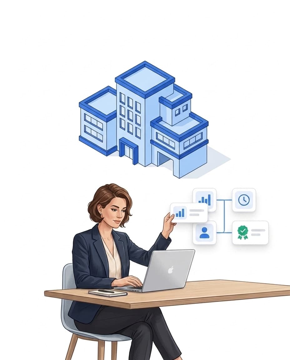
The dashboard draws on the operational data your teams record anyway – from time tracking, patrols and reports.
- ✓Metric cards: attendance, punctuality, reports and patrols for the selected time range.
- ✓Hours in view: hour trend and cumulative hours across the range.
- ✓Property traffic light: green, yellow or red per property – red means scheduled work was missed.
- ✓List tiles: current tasks, reports, notifications and exports – each linking into its area.

See live what happens on site
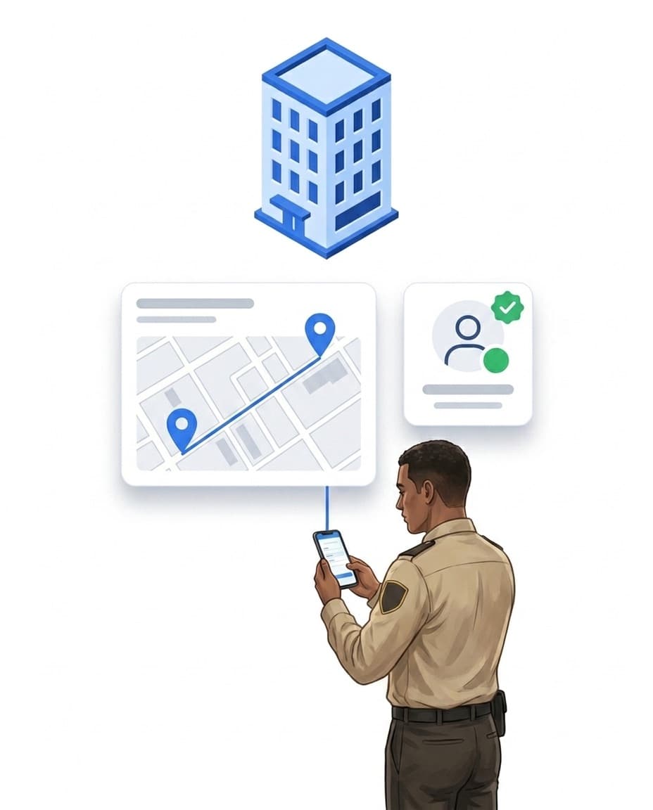
The live map shows properties and the positions of checked-in devices, live attendance lists who is on duty right now. And when nobody is looking at the dashboard, the alerting takes over: it actively reports deviations via push, e-mail, SMS or phone call.
- ✓Live positions: locations of checked-in devices stream straight onto the map.
- ✓Present counter: how many employees are checked in right now – one glance is enough.
- ✓Property traffic light: missed shifts or patrols turn the property red.
- ✓Permissions respected: what a role may see is controlled by the permission management.
Manage by exception: only see what needs attention
Management does not have to review every properly completed task. The dashboard shows what needs attention: open and overdue tasks, critical incidents, areas that keep standing out. Everything else runs — and still stays fully documented.
- ✓Overdue first: list tiles show open and overdue tasks with a direct jump into the item.
- ✓Critical items report themselves: automation rules notify on overdue tasks and highly rated incidents — via push, e-mail or SMS.
- ✓Completed work stays documented: anyone who wants the details finds every record with photo, time and user in the reports.
The control-room chain: see it – and still get alerted
The dashboard is your view of operations, but it does not work alone: what shows up as a deviation on a tile has usually already been reported by the alerting – even when nobody is watching.
FAQ
Frequently asked questions about the KPI dashboard (FAQ)
What is a KPI dashboard?
A KPI dashboard is an overview that shows the most important metrics of an operation in one place. In LiteLog these include attendance, punctuality, working hours, patrols and incident reports – plus live views such as the map with the positions of checked-in devices.
Can every user build their own dashboard?
Yes. Every user arranges their tiles via drag and drop – with the metrics that matter for their role. Templates for security, cleaning and care services give you a starting point, or you adopt a colleague's dashboard as a team template.
How up to date are the metrics?
The live map receives position data continuously over a direct server connection. The remaining tiles reload when you open the dashboard and whenever you change the time range or the property filter.
Which metrics can I display?
Available tiles include attendance, punctuality, reports and patrols for the selected time range, live attendance with a present counter, the live map, hour trends, a property traffic light, and list tiles for tasks, reports, notifications and exports.
Can I export the dashboard?
Yes. The dashboard can be exported as a PDF – for filing or the management round.
Is the KPI dashboard included in every package?
Yes. The KPI dashboard is part of every package.
Does management have to check every completed task?
No. The dashboard is built for exceptions: what is open, overdue or critical becomes visible. Completed work stays audit-proof in the background — with photo, timestamp and user — and can be found in seconds when needed.